Thursday, November 30, 2017

WPF Tip #20 - Extended WPF Toolkit - IconButton Control

It's time to explore a new control in the Extended WPF Toolkit, maintained on GitHub by Xceed and the WPF community. Today, we will take a quick look at the IconButton control, which is new to v3.2.0 of the toolkit (released on Sept. 25th).

IconButton derives from a WPF Button and adds the ability to optionally place an Image to the left or right of your button's Content. There are a handful of properties available on top of the existing Button properties - Icon and IconBackground plus properties to change the button's appearance when users mouse over or press the button:
  • MouseOverBackground
  • MouseOverForeground
  • MouseOverBorderBrush
  • MousePressedBackground
  • MousePressedForeground
  • MousePressedBorderBrush
These state-based properties are self-explanatory, so I created a brief example which uses only the Icon and IconLocation properties.

<xctk:IconButton Content="Launch Me" Padding="4" 
                  HorizontalAlignment="Center" VerticalAlignment="Center" 
                  IconLocation="Right">
     <xctk:IconButton.Icon>
         <Image Source="/WpfApp1;component/Images/Launchpad_Icon.png" 
                Width="16" Margin="4,0,0,0"/>
     </xctk:IconButton.Icon>

</xctk:IconButton>


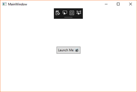
The result is a window with a single "Launch Me" IconButton. There's an Apple-style launch icon to the right of the text set in the Content property. The image I used is a .png file in my project's Images folder set as a Resource. If you wanted to deploy the actual .png file, you would update the file to be "Content" and set the Image's Source property to "Images/Launchpad_Icon.png". This is the same practice you would use for any WPF image source.

All of these properties can be set up via MVVM, data binding and code in your ViewModels to load the image and set its location at runtime based on other application configuration or user preferences.

Here's is a look at the window at runtime:

wpf_xctk_iconbutton1

It's a simple control that can save you a little bit of control templating. If this is something you could use in your project, the toolkit is free and available on NuGet.

Happy coding!

del.icio.us Tags: ,

Thursday, September 7, 2017

WPF Tip #19 - Extended WPF Toolkit - Zoom in with the Magnifier Control

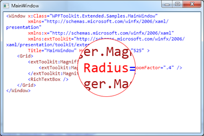
It's time to examine another control from the Extended WPF Toolkit, maintained on GitHub by Xceed and the WPF community. Today, we will look at an example of how easy it is to add a zoom feature to your WPF application with the Magnifier control.

Magnifier_magnifier_withborder

In the Xaml below, I have added a Magnifier to the top-level grid in my Window.

<Grid>

    <tk:MagnifierManager.Magnifier>
         <tk:Magnifier BorderBrush="MediumPurple"
                               BorderThickness="2"
                               Radius="80" 
                               ZoomFactor=".4" />
     </tk:MagnifierManager.Magnifier>

    <tk:CheckListBox ItemsSource="{Binding Sentences, IsAsync=True}"
                      SelectedItem="{Binding SelectedSentence}"
                      Command="{Binding ItemSelectedCommand}"/>


The CheckedListBox from Tip #18 is still in place, displaying results from my Bacon Ipsum generator from Tip #17. Running the application, we see my random list items with a zoom region that follows my mouse as I move it around the Window.

zoom.bacon

Pretty simple! Go check it out for yourself. You can easily add a bound visibility property to hide/show the control from a toolbar or other button in your app.

Happy coding!

del.icio.us Tags: ,,

Monday, August 14, 2017

WPF Tip #18 - Extended WPF Toolkit - Using the CheckedListBox Control

In today's tip, we're going to take a quick look at another control in the Extended WPF Toolkit, the CheckedListBox control.
CheckListBox_wpf
This control provides all of the functionality expected from a ListBox with the addition of checkboxes as a visual cue to indicate the selection state of each item.

Using the control is quite simple. Here's an example of the XAML required to display a CheckedListBox on a WPF window. It is binding to the same collection of Sentence objects used in Tip #17.

<tk:CheckListBox ItemsSource="{Binding Sentences, IsAsync=True}"
                  SelectedItem="{Binding SelectedSentence}"
                  Command="{Binding ItemSelectedCommand}"/>

ItemsSource binding to a collection to populate the list items. SelectedItem provides a way to find out the currently 'selected' item, the last item checked/unchecked. The Command will fire each time an item in the list is checked or unchecked, allowing ViewModel logic to act on this change.

Go give it a try in your WPF project. Happy coding!


del.icio.us Tags: ,

Wednesday, August 2, 2017

WPF Tip #17 - Extended WPF Toolkit - BusyIndicator Control

Welcome back to another Extended WPF Toolkit sample. In this sample, we'll take a look at the BusyIndicator control. This easy to use control provides a quick way to inform your users that a control or Window is currently being refreshed by a long-running process. This is a great way to both update your users of progress and keep them from interacting with the controls that are updating.
Here is a fun little example that wraps a WPF DataGrid in a BusyIndicator. This is the entirety of the XAML inside the root Grid on the application's main window.

<tk:BusyIndicator IsBusy="{Binding IsGridLoading}" BusyContent="Loading, please wait..." DisplayAfter="0">
     <DataGrid local:Commands.DataGridDoubleClickCommand="{Binding GridDoubleClickCommand}" ItemsSource="{Binding Sentences, IsAsync=True}"/>
</tk:BusyIndicator>

The DataGridDoubleClickCommand is a work-around to make the DataGrid's MouseDoubleClick event work with ICommand in when data binding in MVVM. More info here.

In the MainViewModel, there is an IsGridLoading boolean property that will be used to toggle the BusyIndicator on/off. The GridDoubleClickCommand invokes OnGridDoubleClicked() when the user double-clicks somewhere on the DataGrid at runtime. In this method, we're clearing and repopulating the Sentences ObservableCollection to which our DataGrid is bound. Notice the use of async/await. This is necessary to make the BusyIndicator appear. Without this, the UI will freeze during the update and never show the BusyIndicator control.

private async void OnGridDoubleClicked()
{
     //set the IsBusy before you start the thread
     IsGridLoading = true;
     RaisePropertyChanged(nameof(IsGridLoading));

     //no direct interaction with the UI is allowed from this method
     lock (_sentenceLock)
     {
         Sentences.Clear();
     }

     await BuildSentenceList(5, 15, 25, 50);

     //work has completed. you can now interact with the UI
     IsGridLoading = false;
     RaisePropertyChanged(nameof(IsGridLoading));
}

The _sentenceLock allows us to update our ObservableCollection on a background thread. You must also initialize the collection with this code in your constructor. This tells WPF to update the collection on the UI thread and which lock object to use. More info here.

BindingOperations.EnableCollectionSynchronization(Sentences, _sentenceLock);

Each row in the DataGrid will be populated with some random Bacon Ipsum data in the BuildSentenceList method. There is an API if you would like to remove the hard-coded array of words.

private async Task BuildSentenceList(int minWords, int maxWords,
     int minSentences, int maxSentences)

{
     var words = new[]{"bacon", "ipsum", "dolor", "tail", "amet", "swine",
         "chicken", "short", "loin", "jowl", "turkey", "ball", "tip",
         "beef", "shank", "rump", "t-bone", "ham", "porchetta", "filet",
         "pork", "jerky", "hock", "meatball", "biltong", "steak", "brisket"};

     var rand = new Random();
     int numSentences = rand.Next(maxSentences - minSentences)
                        + minSentences + 1;
     int numWords = rand.Next(maxWords - minWords) + minWords + 1;

     var result = new StringBuilder();

    Task t = Task.Run(() =>
     {
         for (int s = 0; s < numSentences; s++)
         {
             for (int w = 0; w < numWords; w++)
             {
                 if (w > 0)
                 {
                     result.Append(" ");
                 }
                 result.Append(words[rand.Next(words.Length)]);
             }
             result.Append(". ");

            lock (_sentenceLock)
                 Sentences.Add(new Sentence() {SentenceContent = result.ToString()});

            Thread.Sleep(100);

            result.Clear();
         }
     });

    await t;

}

When the code to populate the grid fires, thanks to the 100ms Thread.Sleep between each row generated, you can see the grid slowly populating with data behind the busy indicator.

baconipsum-loading

It's a great control. Just remember to update your data on a background thread!

Happy coding!

del.icio.us Tags: ,,,

Tuesday, July 25, 2017

WPF Tip #16 - Extended WPF Toolkit - ChildWindow & MessageBox Controls

Welcome to another Extended WPF Toolkit tip. In this tip, we will look at a couple of simple uses of the ChildWindow and MessageBox controls.

The ChildWindow control is a handy alternative to opening a separate dialog from the current application window, collecting a few pieces of data. The MessageBox operates similarly, but only presents some information and allows the user to respond, like any typical WinForm or WPF MessageBox.

In an MVVM world, opening another dialog typically either involves another View/ViewModel combination or a service to open a simple message/input dialog and return the result to the current View/ViewModel. This control is best used to replace a simple MessageBox service or when another View/ViewModel are being considered, but logically the data collected is limited and still belongs in the current ViewModel.

The use of the controls consists of a WindowContainer element containing one or more ChildWIndow and MessageBox elements. In this sample, the Window's main grid contains a WindowContainer with two ChildWindow elements and one MessageBox. They all begin with a Closed WindowState, and are opened with a button click. Here is a snippet of the view's XAML:

<StackPanel Grid.Row="2" Orientation="Horizontal" VerticalAlignment="Top">
     <Button Content="Toggle Window 1" Height="40" Width="120" Margin="2" Command="{Binding ButtonOneCommand}"/>
     <Button Content="Toggle Window 2" Height="40" Width="120" Margin="2" Command="{Binding ButtonTwoCommand}"/>
     <Button Content="Toggle Window 3" Height="40" Width="120" Margin="2" Click="ButtonBase_OnClick"/>
</StackPanel>

<tk:WindowContainer Grid.Row="2">
     <tk:ChildWindow WindowBackground="Blue"
                       Left="75"
                       Top="50"
                       Width="275"
                       Height="125" WindowState="{Binding WindowOneState}">
         <TextBlock Text="This is a child window" Padding="10"/>
     </tk:ChildWindow>

    <tk:ChildWindow WindowBackground="Green"
                       Left="175"
                       Top="125"
                       Width="275"
                       Height="125" WindowState="{Binding WindowTwoState}">
         <StackPanel>
             <TextBlock Text="This is a child window with a checkbox." Padding="10"/>
             <CheckBox Content="Check me!" Margin="8"/>
         </StackPanel>
     </tk:ChildWindow>

    <tk:MessageBox Caption="Toolkit Message" x:Name="SampleMsgBox"
                      Text="You have an alert!"/>

</tk:WindowContainer>

The MessageBox's button has a Click event handler to display the control:

private void ButtonBase_OnClick(object sender, RoutedEventArgs e)
{
     SampleMsgBox.ShowMessageBox();
}

The two ChildWindows are opened with Commands attached to the first two buttons in our Window's ViewModel:

private void OnButtonOneClicked()
{
     if (WindowOneState == WindowState.Open)
         WindowOneState = WindowState.Closed;
     else
         WindowOneState = WindowState.Open;
    RaisePropertyChanged(nameof(WindowOneState));
}

public RelayCommand ButtonOneCommand { get; private set; }

private void OnButtonTwoClicked()
{
     if (WindowTwoState == WindowState.Open)
         WindowTwoState = WindowState.Closed;
     else
         WindowTwoState = WindowState.Open;
    RaisePropertyChanged(nameof(WindowTwoState));
}

public RelayCommand ButtonTwoCommand { get; private set; }

The ChildWindows can be closed again by using the close button on the element or by clicking it's Open button again. This second option is not available when the ChildWindow has IsModal set to true. You'll notice the WindowState property of the two ChildWindows is bound to the ViewModel. This two-way binding ensures the IF statements in the command methods will work properly regardless of how each window is closed.

Here is a look at the Window with the second ChildWindow open. This control contains a TextBlock and a CheckBox inside a StackPanel. The ChildWindow can contain only one direct child, like a Window or UserControl.

childwindows-wpf

There are tons or other uses for these controls and many properties I haven't touched on at all. Go explore them for yourself and download the toolkit today.

Happy coding!


del.icio.us Tags: ,,

Tuesday, July 18, 2017

WPF Tips Update - The Extended WPF Toolkit Has a New Home

Hello WPF fans! You may have noticed that I am a fan of Xceed's free Extended WPF Toolkit. I am actually a huge fan of free tools and productivity gains in general.

This week when I started working on WPF Tip #16, I was pleased to notice that Xceed has released v3.1 of the Extended WPF Toolkit and moved the source code from CodePlex to GitHub! The move to GitHub was, of course, motivated by Microsoft announcement that CodePlex is shutting down in the coming months.

Download, Star and Watch the Extended WPF Toolkit on GitHub

The changelog for v3.1.0 includes 37 fixes and enhancements. The Plus Edition snagged an additional 19 fixes and improvements including a Windows 10 theme, but Plus received v3.1.0 last year. It pays to pay, it seems.

wpftoolkit-github

Learn all about the toolkit on GitHub or check out WPF Tip #11. This tip was my introductory post about the controls. And be sure to stay tuned for more WPF Tips about these controls and lots more!

Happy coding!


Saturday, July 8, 2017

WPF Tip #15 - Extended WPF Toolkit - The DataGrid Control

Tip #15 is a quick detour. We'll get back to using the CalculatorUpDown control in Tip #16.

If you are looking for a quick, free way to upgrade your application's DataGrid look and behavior, the Extended WPF Toolkit includes a DataGrid which provides a significant upgrade over the WPF DataGrid in the .NET Framework.

Here is a simple Grid with a standard DataGrid in the first row and the Toolkit's DataGridControl in the second row. Both are bound to the same ItemsSource, an ObservableCollection of three fictional videos.
<Grid>
    <Grid.RowDefinitions>
        <RowDefinition Height="*"/>
        <RowDefinition Height="*"/>
    </Grid.RowDefinitions>
   
    <DataGrid ItemsSource="{Binding Path=MediaCatalog, IsAsync=True}"/>

    <xcdg:DataGridControl Grid.Row="1" ItemsSource="{Binding Path=MediaCatalog, IsAsync=True}"/>
</Grid>
This is what we get when running the application.


With no customization, there's a much cleaner look. You also get an improved editing experience. When clicking into the PurchaseDate column, the grid detects that the underlying data type is DateTime, and provides a Date Picker to update the value.


For more information about features available in the control, go check out the CodePlex site (migrating soon).

Happy Coding!

Friday, June 23, 2017

WPF Tip #14 - Extended WPF Toolkit - The CalculatorUpDown Control

In this tip, we will continue to explore the free controls available in the Extended WPF Toolkit Community Edition.

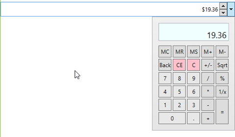
The CalculatorUpDown control is a hybrid of sorts. It takes the functionality of an up/down numeric control and adds a dropdown button. Clicking on the dropdown button pops open a Calculator control. The output of the calculator displays in its window as well as in the text portion of the CalculatorUpDown.

Let's take a simple example of the control's use and walk through a few of the properties and how they impact the control's functionality. Here is the XAML:
<tk:CalculatorUpDown Grid.Row="1" Height="32" VerticalAlignment="Top" FormatString="C2" Watermark="Calculate!" Increment=".01" Maximum="9999.99" Minimum="0.01"/>
Upon first launching the window, this is how the control looks:
calc0
There is a numeric up/down with a watermark reading "Calculate!" and a dropdown button to open the calculator control. Let's click the up button to start.
calc0a
The Increment property is set to ".01" and the FormatString is "C2", so our value has incremented to $0.01 or 1 U.S. cent. You'll notice that the down button is now disabled because the Minimum property is currently equal to the control's Value.

Now to explore the calculator control a little. Click the dropdown button and enter a calculation.
calc1
As you use the calculator, you will notice that the calculator window updates as you enter and calculate values, but the textbox of the control only updates to show results of calculations. If the calculated value falls outside the Maximum or Minimum properties, it will default to those Max/Min values.

There was no code required on our part to add this rich functionality or our application, only the XAML markup seen above. You certainly could take this a step further by adding some data binding and leveraging other properties that the control exposes to do things like allowing the user to change the number format.

Happy coding!

del.icio.us Tags: ,,

Tuesday, June 13, 2017

WPF Tip #13 - Extended WPF Toolkit - ColorCanvas with MVVMLight, Binding and EventToCommand

In Tip #12, we used a ColorCanvas control in a SplitButton to change the Background color of the SplitButton using an event in the code behind. In this tip, we will do the same thing with data binding and commands using MVVMLight.

The first step is to add the MVVMLight NuGet package to the project:

image

Adding the package will add and update several classes in the project. We now have a MainViewModel and ViewModelLocator inside a ViewModel folder. The locator class exposes each ViewModel in the project so they can be bound in your views. To make the locator discoverable to the views in the project, MVVMLight added a new resource to the App.xaml:

<Application.Resources>
   <ResourceDictionary>
     <vm:ViewModelLocator x:Key="Locator" d:IsDataSource="True" xmlns:vm="clr-namespace:WpfApp1.ViewModel" />
   </ResourceDictionary>
</Application.Resources>

Now lets start with the changes we have to make. First remove the event handler from the MainWindow.xaml.cs. The next step is to replace that functionality with some decoupled logic in the MainViewModel. Two things are needed:

  • A ButtonBrush property to bind the SplitButton's Background property.
  • A ChangeBrushColorCommand RelayCommand to bind to the ColorChanged event of the ColorCanvas.

An OnColorChanged method is added to do the work needed when the RelayCommand is invoked. These are hooked up in the constructor, along with some default colors for the SplitButton. I made the button different colors at design-time and runtime as a way to validate that my binding code isn't broken. Here's the complete MainViewModel implementation:

public class MainViewModel : ViewModelBase
{
     public MainViewModel()
     {
         if (IsInDesignMode)
         {
             ButtonBrush = new SolidColorBrush(Colors.LightGray);
         }
         else
         {
             ButtonBrush = new SolidColorBrush(Colors.LightSkyBlue);

            ChangeBrushColorCommand = new RelayCommand<Color?>(OnColorChanged);
         }
     }

    public SolidColorBrush ButtonBrush { get; set; }

    internal void OnColorChanged(Color? p_Param)
     {
         if (p_Param.HasValue)
         {
             ButtonBrush = new SolidColorBrush(p_Param.Value);
         }
         else
         {
             ButtonBrush = new SolidColorBrush(Colors.Transparent);
         }

        RaisePropertyChanged(nameof(ButtonBrush));
     }

    public RelayCommand<Color?> ChangeBrushColorCommand { get; private set; }
}

The next thing we need is a converter class to convert the event args of the ColorChanged event to the Color? parameter type of our RelayCommand. SelectedColorChangedToColorConverter implements the IEventArgsConverter in MvvmLight. It's similar to value converters you may have created for data binding in WPF (see WPF Tip #4).

public class SelectedColorChangedToColorConverter : IEventArgsConverter
{
     public object Convert(object value, object parameter)
     {
         var args = (RoutedPropertyChangedEventArgs<Color?>)value;

        return args.NewValue ?? Colors.Transparent;
     }
}

Finally, lets make a few changes to the MainWindow view.

Set the DataContext for the Window using the ViewModelLocator:

DataContext="{Binding Main, Source={StaticResource Locator}}"

Add the converter to the Window.Resources:

<Window.Resources>
     <ResourceDictionary>
         <local:SelectedColorChangedToColorConverter x:Key="SelectedColorChangedToColorConverter" />
     </ResourceDictionary>
</Window.Resources>

Update the SplitButton to bind its Background property and the ColorCanvas to use the MVVMLight EventToCommand trigger, hooking up our RelayCommand through the converter.

<tk:SplitButton Content="Pick a Color" Height="32" Width="120" Background="{Binding ButtonBrush}">
     <tk:SplitButton.DropDownContent>
         <tk:ColorCanvas x:Name="MainColorCanvas">
             <i:Interaction.Triggers>
                 <i:EventTrigger EventName="SelectedColorChanged">
                     <command:EventToCommand Command="{Binding ChangeBrushColorCommand, Mode=OneWay}"
                                             EventArgsConverter="{StaticResource SelectedColorChangedToColorConverter}"
                                             PassEventArgsToCommand="True"/>
                 </i:EventTrigger>
             </i:Interaction.Triggers>
         </tk:ColorCanvas>
     </tk:SplitButton.DropDownContent>
</tk:SplitButton>

That's it!. Same functionality, but now with better separation between view and code.

Happy coding! (P.S. - I hope to get some proper code formatting hooked up to Blogger soon… or maybe a new blogging platform. Thanks for bearing with me.)


Wednesday, June 7, 2017

WPF Tip #12 - Extended WPF Toolkit - ColorCanvas

Last time in Tip #11, I explained the Extended WPF Toolkit and the different versions that are available. In the quick-n-dirty example, I added a SplitButton with a ColorCanvas that displays when opening the dropdown portion of the buttom.

In this tip, we are going to add just a few lines of code to take the color selected in the ColorCanvas and apply it as the background color of the SplitButton.

Let's start with the Xaml. There are two changes needed here (highlighted below). The first is to name the button so it can be referenced from the application's code. The second is adding a handler to the ColorCanvas' SelectedColorChanged event. This event fires every time the color changes on the canvas and provides the OldValue and NewValue as parameters in the event.

<tk:SplitButton x:Name="mainSplitButton" Content="Pick a Color" Height="32" Width="120">
     <tk:SplitButton.DropDownContent>
         <tk:ColorCanvas SelectedColorChanged="ColorCanvas_OnSelectedColorChanged" />
     </tk:SplitButton.DropDownContent>
</tk:SplitButton>

In the code behind for the Window, I have added the ColorCanvas_OnSelectedColorChanged event handler with some code to set the SplitButton's background color to a new SolidColorBrush the color of the NewValue selected on the ColorCanvas, provided it's not null.

private void ColorCanvas_OnSelectedColorChanged(object sender, RoutedPropertyChangedEventArgs<Color?> e)
{
     if (e.NewValue.HasValue)
     {
         mainSplitButton.Background = new SolidColorBrush(e.NewValue.Value);
     }
}

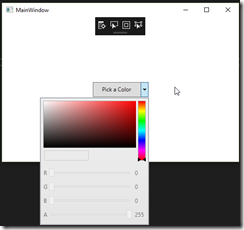
You could add an else condition to handle nulls by setting the background color back to some default color. Here's what the end result looks like.

colorcanvas

If you were following the MVVM pattern in your application, you would handle this through data binding and commands. In Tip #13, we will add MVVMLight to the mix and rework the example to follow this pattern.


del.icio.us Tags: ,,

Thursday, June 1, 2017

WPF Tip #11 - Free Controls with the Extended WPF Toolkit Community Edition

Everyone loves free things. When it comes to WPF controls, there is a wide selection of 3rd party components from which to choose: Telerik, Infragistics, DevExpress, etc. If you're an independent developer or a small business on a tight budget, the Extended WPF Toolkit, maintained by Xceed, is a great choice.

Currently available on Codeplex, the Community Edition of the toolkit includes nearly 50 WPF controls. These are just a few:
Xceed also offers two paid versions of the toolkit with additional controls and technical support, the Plus Edition and the Business Suite for WPF.

The latest release of the community edition is 3.0.0 and was released in Dec. 2016. I have recently contacted Xceed to inquire about their plans for the future of the toolkit and whether it will be migrated to GitHub or another host. As you may be aware, Codeplex is shutting down this year. See Brian Harry's post about the transition to GitHub for Codeplex projects.

EDIT: A representative replied to me to inform me that there will be an announcement about the migration of the Extended WPF Toolkit from Codeplex within a month.

In the spirit of including some code in these tips, here is a quick sample of the little bit of code required to add a SplitButton that opens a ColorPicker control for the user:
<Window x:Class="WpfApp1.MainWindow"
         xmlns="
http://schemas.microsoft.com/winfx/2006/xaml/presentation"
         xmlns:x="http://schemas.microsoft.com/winfx/2006/xaml"
         xmlns:d="http://schemas.microsoft.com/expression/blend/2008"
         xmlns:mc="http://schemas.openxmlformats.org/markup-compatibility/2006"
         xmlns:local="clr-namespace:WpfApp1"
         xmlns:tk="
http://schemas.xceed.com/wpf/xaml/toolkit"
         mc:Ignorable="d"
         Title="MainWindow" Height="350" Width="525">
     <Grid>
         <tk:SplitButton Content="Pick a Color" Height="32" Width="120">
             <tk:SplitButton.DropDownContent>
                 <tk:ColorCanvas />
             </tk:SplitButton.DropDownContent>
         </tk:SplitButton>
     </Grid>
</Window>
The end result when running the app looks like this with the button open:
image
The color picker itself require a little more code to setup. Let's take a look at its use in our next tip.

Happy coding!

del.icio.us Tags: ,

Tuesday, May 16, 2017

WPF Tip #10 - Update ObservableCollection From a Background Thread

Pete Brown has a detailed blog post about updating ObservableCollection from background threads. I wanted to share the link to his post from 2012 and share a quick code snippet that illustrates how to do this in .NET 4.5 and later.

Before .NET 4.5, background updates to an ObservableCollection had to dispatch calls to the UI thread. Now all that is required is making a single call after initializing the collection in your ViewModel or other .NET class:

public ObservableCollection<MyObservableType> MyObservableCollection { get; set; }
 
private object _myCollectionLock = new object();
 
public MainViewModel()
{
    MyObservableCollection = new ObservableCollection<MyObservableType>();
 
    BindingOperations.EnableCollectionSynchronization(MyObservableCollection, _myCollectionLock);
}

Go check out Pete's post with the full details.

Cheers!

del.icio.us Tags: ,,

Wednesday, April 26, 2017

WPF Tip #9 - ObservableCollection and the CollectionChanged Event

Tip #9 will examine something that seems like it should work according to the documentation on MSDN, but I have seen it not work as expected.

When using ObservableCollection<T>, if some code in your application needs to react when items are added or removed from the collection the CollectionChanged event can be handled.

private ObservableCollection<Pill> _pills = new ObservableCollection<Pill>();

public MainWindow()
{
    InitializeComponent();
    Pills.CollectionChanged += Pills_CollectionChanged;
}

public ObservableCollection<Pill> Pills
{
    get { return _pills; }
    set { _pills = value; }
}

void Pills_CollectionChanged(object sender, System.Collections.Specialized.NotifyCollectionChangedEventArgs e)
{
    // Pills Collection Changed - do something
}

The issue I have encountered with this code is that setting that value of the Pills property directly does not always fire the CollectionChanged event.

Pills = someOtherPillCollection;

What I did to work around this was to remove the property setter and only work with the collection through its properties. In this case, by using Clear() and Concat<T>().

Pills.Clear();
Pills.Concat<Pill>(someOtherPillCollection);

ObservableCollection does not have an AddRange() method. You could write your own extension method to do it, but I prefer to use the LINQ extension method Concat<T>().

Has anyone else seen this same issue?


del.icio.us Tags: ,

Thursday, April 6, 2017

WPF Tip #8 - Grids and Rendering Performance

Today's tip is a quick one. It's about choosing the best panel for the layout of the UIElements in your WPF Window or Control.

Many developers will default to putting everything into a Grid. It's easy. They're flexible and offer many layout options. When a Window is relatively simple and performance is not being analyzed by users or stakeholders, using Grids everywhere might be ok. However, professional WPF developers should make it a practice to learn the differences in features and performance of each panel and choose the best one for a particular layout scenario.

In general, you should first try a StackPanel. If you can accurately lay out your Window with StackPanels without a deep nested web of them, they are the best way to go. They are much faster than Grids in both measurement of elements and layout/arrangement.

There are several other panels included in WPF. These are the most common, ranked from fastest to slowest (in general):

  1. Canvas
  2. StackPanel
  3. WrapPanel
  4. DockPanel
  5. Grid

This ranking is based on the accepted answer in this StackOverflow question. If you're interested in reading more about each of the panels and how they 'stack' up in different scenarios, I highly recommend reading the question and top answer.

Cheers!


del.icio.us Tags: ,

Thursday, March 30, 2017

WPF Tip #7 - Freeze WPF Freezable Objects from Code

In Tip #6, we took a vector image resource and set it to Freeze = True in the XAML markup. Suppose that you need the resource to freeze at some point later in the application's execution. You can simply add this code to that point in the application:
If mySimpleImage.CanFreeze Then
    ' Makes the vector image frozen.
    mySimpleImage.Freeze()
End If
Yes, I'm giving VB some love in today's tip.

Checking CanFreeze is necessary because not all Freezable objects can be frozen at every point in a WPF application's lifecycle. If Freeze() is called on an object that cannot currently be frozen, an exception will be thrown.

del.icio.us Tags: ,,

Monday, March 27, 2017

WPF Tip #6 - Freeze Vector Image Resources

The next several tips will examine Freezable objects. The description from MSDN:

A Freezable is a special type of object that has two states: unfrozen and frozen. When unfrozen, a Freezable appears to behave like any other object. When frozen, a Freezable can no longer be modified.

A few examples of WPF Freezable objects are Brushes, DrawingImages and Animation KeyFrames. If an application uses any of these resources and they are not going to be modified, they should be frozen. This will improve the performance of the application, as less processing will be used to re-render graphical elements.

Here is a quick example of Freezing a DrawingImage. Consider vector graphics used in fixed-size elements on a window (toolbar buttons, for example). These are good candidates to be frozen.

   <DrawingImage x:Key="SimpleImage" presentationOptions:Freeze="True"> 
      <DrawingImage.Drawing> 
         <DrawingGroup> 
            <DrawingGroup.Children> 
               <GeometryDrawing Brush="Black"> 
                  <GeometryDrawing.Geometry> 
                    <EllipseGeometry Center="50,50" RadiusX="50"  RadiusY="50"/> 
                  </GeometryDrawing.Geometry> 
                  <GeometryDrawing.Pen> 
                    <Pen Brush="Red" Thickness="2" /> 
                  </GeometryDrawing.Pen> 
               </GeometryDrawing> 
            </DrawingGroup.Children> 
         </DrawingGroup> 
     </DrawingImage.Drawing> 
   </DrawingImage>


Happy coding!


Wednesday, March 22, 2017

WPF Tip #5 - Data Binding with IMultiValueConverter

In Tip #4, we examined the use of IValueConverter with WPF binding. If you are using MulitBinding, a converter class that implements IMultiValueConverter is needed.

Like the IValueConverter, the class must implement Convert and ConvertBack methods. The difference being the multiple values come in as an object[] parameter in Convert() and go back out as an object[] return value in ConvertBack(). The following example takes two string values as input and returns them concatenated with a pipe '|'. It will convert them back using the Split function, assuming your text value contains no other pipes.

public class TextAppendMultiConverter : IMultiValueConverter
{
    public object Convert(object[] values, Type targetType, object parameter, CultureInfo culture)
    {
        return String.Concat(values[0], "|", values[1]);
    }

    public object[] ConvertBack(object value, Type[] targetTypes, object parameter, CultureInfo culture)
    {
        return (value as string).Split('|');
    }
}

This code will use the converter in a WPF TextBox's Text property MultiBinding.

<TextBox>
    <TextBox.Text>
        <MultiBinding Converter="{StaticResource TextAppendMultiConverter}" FallbackValue="Busy loading...">
            <Binding Path="IntroText"/>
            <Binding Path="ContentText"/>
        </MultiBinding>
    </TextBox.Text>
</TextBox>

The FallbackValue will be displayed if the converter fails or data is unavailable in the attached DataContext.

Next time, we will shift gears away from data binding. Happy coding!


del.icio.us Tags: ,,

Thursday, March 16, 2017

WPF Tip #4 - Data Binding with IValueConverter

The first three tips have all been related to WPF data binding. Let's continue the theme with IValueConverter. IValueConverter is used in conjunction with the Converter parameter on a property's Binding.

Converters are used whenever the type of the property being bound does not match the type of the property in the binding source. Converting a boolean value to Visibility enum value is the most common conversion throughout all Xaml code. It is so common that the .NET Framework has its own BooleanToVisibilityConverter class that implements IValueConverter.

To implement your own converter, simply create a class that implements the IValueConverter interface. The interface has two methods, Convert() and ConvertBack(). If your property will never update its binding source, the ConvertBack() method does not need to be implemented. If you leave the default code Visual Studio puts in newly generated methods to throw a NotImplementedException, you will quickly find out if the ConvertBack() method is necessary for your converter.

This simple example is a variation on the BooleanToVisibilityConverter. It is an IndecisiveEnumToVisibilityConverter. Here is what my IndecisiveEnum looks like:

public enum IndecisiveEnum
{
    Yes,
    Probably,
    ThinkSo,
    NotSure,
    No,
    WhyWouldAnyoneDoThat,
    NotUnlessEveryoneElseIsDoingIt
}

The converter needs to take one of these values and return a Visibility. Here's the implementation of Convert() and ConvertBack().

public object Convert(object value, Type targetType, object parameter, CultureInfo culture)
{
    if (!(value is IndecisiveEnum))
        return Visibility.Collapsed;

    var typedValue = (IndecisiveEnum)value;

    switch (typedValue)
    {
        case IndecisiveEnum.Yes:
        case IndecisiveEnum.Probably:
        case IndecisiveEnum.ThinkSo:
            return Visibility.Visible;
        case IndecisiveEnum.No:
        case IndecisiveEnum.WhyWouldAnyoneDoThat:
            return Visibility.Collapsed;
        case IndecisiveEnum.NotUnlessEveryoneElseIsDoingIt:
            return IsEveryoneElseDoingIt() ? Visibility.Visible : Visibility.Collapsed;
        case IndecisiveEnum.NotSure:  // return a 50/50 random chance of yes/no
            Random gen = new Random();
            int prob = gen.Next(100);
            return prob <= 50 ? Visibility.Visible : Visibility.Collapsed;
        default:
            return Visibility.Collapsed;
    }
}

public object ConvertBack(object value, Type targetType, object parameter, CultureInfo culture)
{
    if (!(value is Visibility))
        return IndecisiveEnum.No;

    var typedValue = (Visibility)value;

    switch (typedValue)
    {
        case Visibility.Collapsed:
        case Visibility.Hidden:
            return IndecisiveEnum.No;
        case Visibility.Visible:
            return IndecisiveEnum.Yes;
        default:
            return IndecisiveEnum.No;
    }
}

For the IndecisiveEnum.NotUnlessEveryoneElseIsDoingIt value, the case calls a method which we'll pretend calls a web service to find out if everyone else is actually doing it or not. If the input value is NotSure, then a random call will return either Visible or Collapsed. Converting back is a little more straightforward.

Consuming this converter in the WPF Xaml consists of two parts. First, the converter must be defined as a resource.

<Window.Resources>
    <local:IndecisiveEnumToVisibilityConverter x:Key="IndecisiveEnumToVisibilityConverter" />
</Window.Resources>

Finally, the resource can be used in the binding for our TextBox Visibility property.

<TextBox Visibility="{Binding IsVisible, Converter={StaticResource IndecisiveEnumToVisibilityConverter}}"/>

That's it. Next time we'll look at the IMultiValueConverter, which is used with MultiBinding.


del.icio.us Tags: ,,,

Monday, March 13, 2017

WPF Tip #3 - Using FallbackValue with MultiBinding

Let's take another look at using a FallbackValue in WPF. In Tip #2, it was used to provide a temporary value while waiting for an async data binding value to return from a slow-running ViewModel property getter.

A more common use of FallbackValue is in conjunction with MultiBinding. MultiBinding allows a single element's property to be bound to multiple objects on your data source (ViewModel, relative sources, etc.) If the values of the MultiBinding are unavailable or invalid, or use converters that return invalid results, the MultiBinding's FallbackValue will be displayed. This StackOverflow answer provides a great explanation with some examples.

Here is a simple example using the same Xaml file from Tip #2.

<TextBox Grid.Row="1">
     <TextBox.Text>
         <MultiBinding FallbackValue="Busy loading." StringFormat="Plain text is {0} and rich text is {1}.">
             <Binding Path="SlowText" IsAsync="True"/>
             <Binding Converter="{StaticResource RtfToPlainTextConverter}" Path="RichText"/>
         </MultiBinding>
     </TextBox.Text>
</TextBox>


The TextBox is now using a MultiBinding to return the original SlowText from last time as async plus some RichText property being converted to plain text with an RtfToPlainTextConverter that has been added to the project. If the bindings fail, the converters fail, or our async binding is really slow, the FallbackValue will be displayed in the TextBox.Text.

What is a converter, you ask? This sounds like a great subject for our next couple of WPF Tips. Stay tuned!

del.icio.us Tags: ,,

Sunday, March 5, 2017

WPF Tip #2 - Using FallbackValue with Async WPF Bindings

In Tip #1, we examined how an IsAsync attribute can be added to WPF bindings to allow an application's UI to remain responsive while waiting for long-running ViewModel property getters.

It was mentioned that setting the FallbackValue on an object provides a way to put a default value into a property while waiting for the live data to populate through the ViewModel. This can be used to populate actual default values or to display some placeholder text to indicate to users that the live data is still loading.

Here is a simple example of using a FallbackValue with IsAsync on a standard WPF TextBox bound to a ViewModel property named SlowText.

<TextBox Text="{Binding Path=SlowText, IsAsync=True, FallbackValue='Loading data from a slow connection...'}"/>

This will display "Loading data from a slow connection…" until the real data is returned from the SlowText property.

In Tip #3, we will look at the use of FallbackValue with MultiBinding.


del.icio.us Tags: ,

Saturday, March 4, 2017

WPF Tip #1 - IsAsync and WPF Bindings

Welcome to a new series of quick tips for .NET desktop developers using WPF. Expect new tips (at least) weekly on this site. For links to other great resources for .NET developers, please check out my daily link blog, the Morning Dew.

IsAsync

The IsAsync attribute on a WPF data binding allows your UI thread to remain responsive to user activity while the property to which a control is bound is retrieving data. This can be useful if the application must fetch large amounts of data or when a slower database or web data source is invoked.

Here's a sample usage of the attribute on a simple ListView. This ListView gets a list of items from a user's media catalog and presents them in a simple grid format with headers.

<ListView HorizontalAlignment="Left" Margin="10" VerticalAlignment="Top" ItemsSource="{Binding Path=MediaCatalog, IsAsync=True}">
    <ListView.View>
        <GridView>
            <GridViewColumn Header="Artist" DisplayMemberBinding="{Binding Path=Artist}" Width="80"/>
            <GridViewColumn Header="Title" DisplayMemberBinding="{Binding Path=Title}" Width="100"/>
            <GridViewColumn Header="Category" DisplayMemberBinding="{Binding Path=Category}" Width="80"/>
            <GridViewColumn Header="Purchase Date" DisplayMemberBinding="{Binding Path=PurchaseDate}"/>
            <GridViewColumn Header="Number of Views" DisplayMemberBinding="{Binding Path=NumberOfViews}"/>
            <GridViewColumn Header="Year" DisplayMemberBinding="{Binding Path=Year}"/>
        </GridView>
    </ListView.View>
</ListView>

While the data is being retrieved by the MediaCatalog's getter, a FallbackValue can be specified. In this case, a data row with a Title of "Loading…" could be used to indicate to the application's user that live data is on its way.

More information on WPF data binding on MSDN.